This is the sixth in the Basics of Dymola series following on from the post about the use of the Variable Browser within the simulation window. This post will follow on from that post by expanding on the use of the Variable Browser and other plotting features within the simulation window.

A plotting window can be created by selecting the New Plotting Window button highlighted in red in Figure 1 or choosing the dropdown menu next to it that allows the user to open either a New Plot Window or a New Table Window. This allows the user to use the variable browser to select variables to plot against either time (default) or another variable.
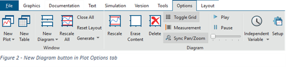
There can be multiple plots displayed within the same window by selecting the New Diagram button to the right of Open New Window, highlighted in red in Figure 2, this inserts a second plot within the same window.
In a previous Basics of Dymola post the features of the Variable Browser were described and how variables can be searched for and filtered after a simulation has been run. Also covered was the ability to use the Difference and Original features within the Advanced tab of the Variable Browser that allows the difference between selected data to be shown with the original plots hidden.
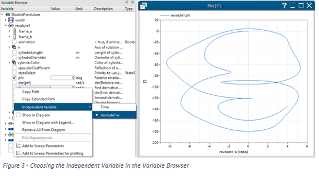
Signals are plotted against time by default but they can also be plotted against other variables through the Variable Browser by right clicking on the desired variable to use as the x axis, selecting Independent Variable then selecting the path of the variable as shown in Figure 3. This then plots all variables in the selected window against the variable selected. To undo this right click on any variable within the variable browser and select Independent Variable again and then select Time, ensuring that the desired plot window is active.
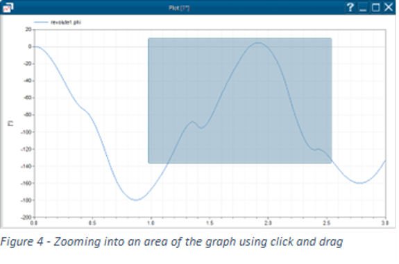
Plots are automatically resized to fit the data that they are displaying but if a user needs to investigate a certain area of data then there are several methods of manipulating the displayed data. An area can be enlarged by clicking and dragging on the plot such that the desired area highlighted in Figure 4.
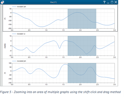
To investigate a certain section of the data along either axis then if the shift button is held while dragging in the direction the desired axis then that range of the plot will be displayed while retaining the other axis range. This can be done across multiple plots within the same window to show the same range in X as long as they have the same X axis as shown in Figure 5.
Another method of display manipulation is by holding the control button while clicking the plot display the signal and axis can be dragged around the plot; holding the control button while using the mouse scroll wheel will zoom in and out of the centre of the plot display.

All of these methods can be undone by using the rescale buttons found in the same toolbar as highlighted below in red below. Either the active plot within the window with the right rescale button or all the plots can be rescaled to fit within each plot using the left.
A user can also plot an expression using the Plot Expression button highlighted above in green.
The buttons highlighted in blue in Figure 6 remove data from the plots, with the left button clearing the active plot and the right button removing the active plot within a window if multiple plots exist.
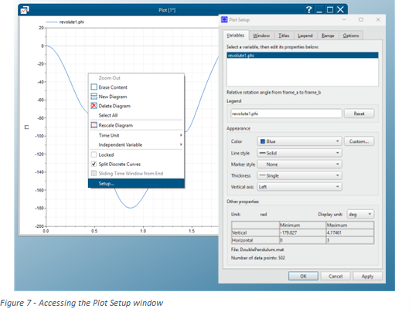
There are additional options that allow the user to change how the data is displayed within a plot by right clicking on a plot and then selecting Setup that then accesses the Plot Setup menu as shown in Figure 7. From here the Variable display properties such as legend name and colour can be changed for each of the signals in the plot. From here it also allows modification to the range of the plot in x and y and legend display properties by selecting the relevant tab at the top.
The display of the data can also be manipulated by right clicking on a selected signal trace or the name of the data in the legend, this brings up the menu shown below. It shows that the colour, line style and which vertical axis the data is displayed on can be varied. If a trace has an associated unit, such as degrees (deg) in the example, if the Display Unit menu is expanded then any units that are of the same type can set as the output. The list can be added to by running an additional display unit function. An example of a function that adds some US imperial units can be found within the Dymola Program files: Program Files (x86)\Dymola 2017\insert\displayunit_us.mos.
A user can create an additional function to add any conversions by extending the form and syntax used within the example function. This also adds the unit conversions to the parameter inputs. While inputs and outputs can be changed as above this does not change the raw data of the signal, which should always be in SI units, only how it is displayed in the selected plot. The original unit that is output from the simulation can be found either in the Variable Browser or in the selected variable options of the Variables tab of the Plot Setup window as shown above. Also shown below is the ability to carry out some simple mathematical evaluations on the selected trace by expanding the Signal Operators menu.
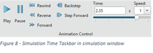
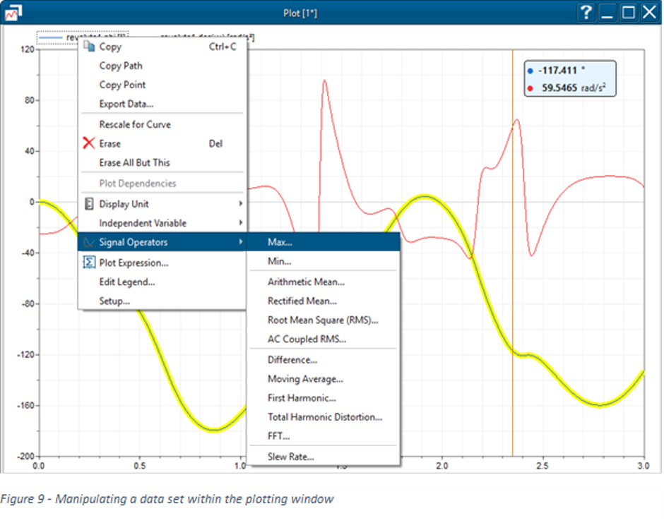
There is also the ability to have a Measurement Cursor that can be dragged horizontally and outputs the value of any signal on a plot according to the X axis, in this case time. This can be toggled using the button highlighted in purple in Figure 6. When using time as the dependant variable there is also the ability to go to a specific time by using the Simulation Time bar as shown below. When changing the time either through dragging the Measurement Cursor or using the Simulation Time bar the animation will also be displayed at the matching time.